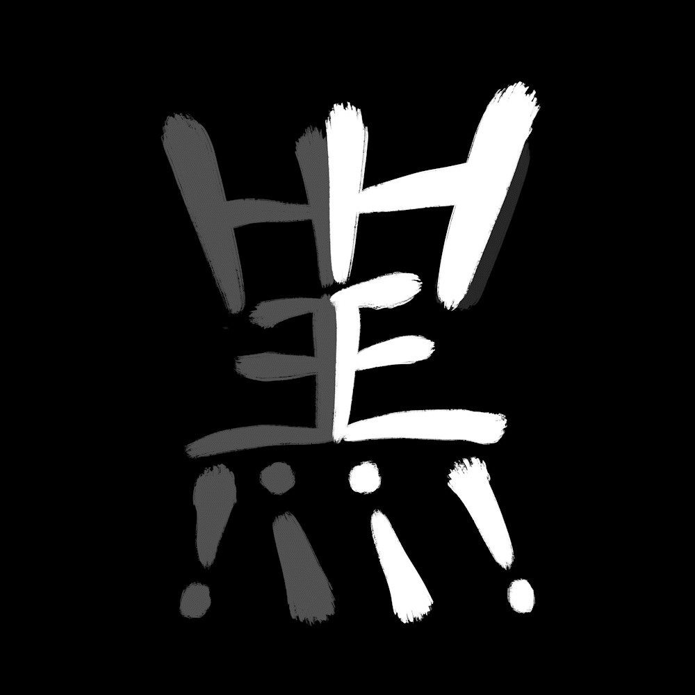
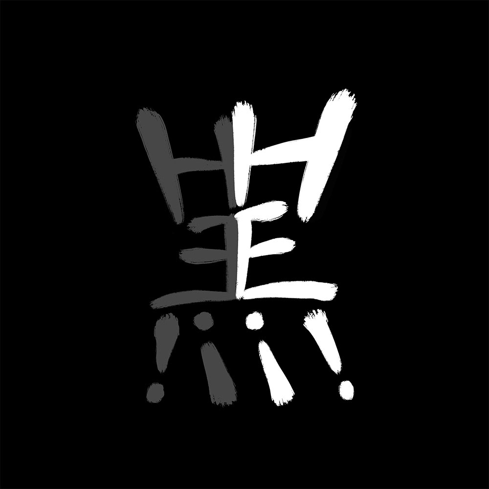
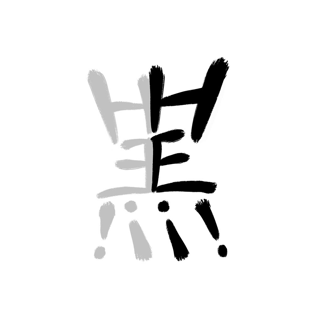
Logo design for a vibrant content creation company called Hei!. Not to be mistaken for a IKEA inspiration but it is taken inspiration from the chinese character of black (黑). Reason for this is due to it's parent company having a very strong branding affiliation to the colour black. And rather than saying that it is a fun and vibrant company, why not show it in the branding itself.