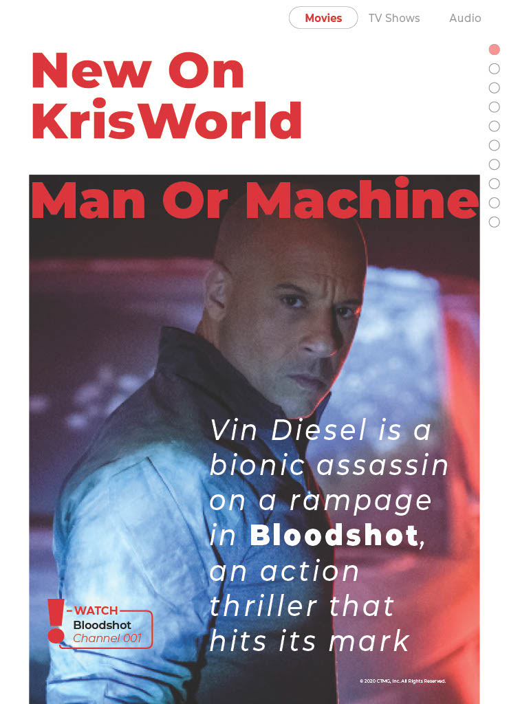
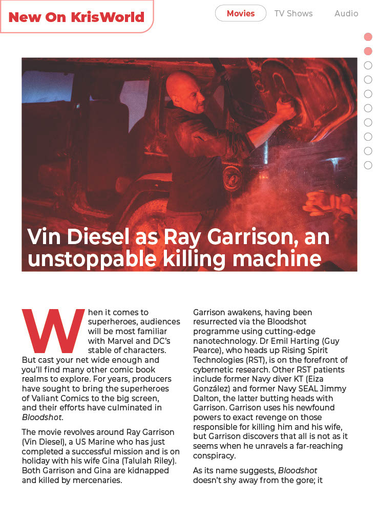
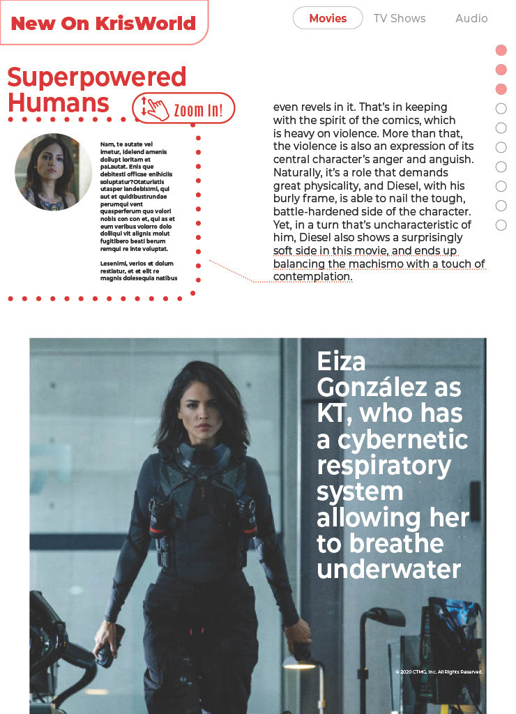
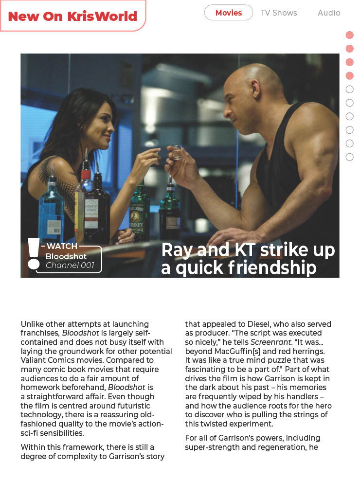
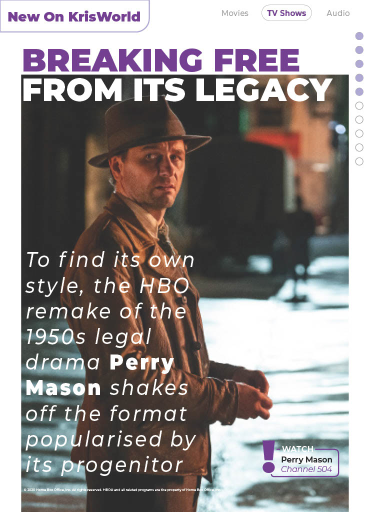
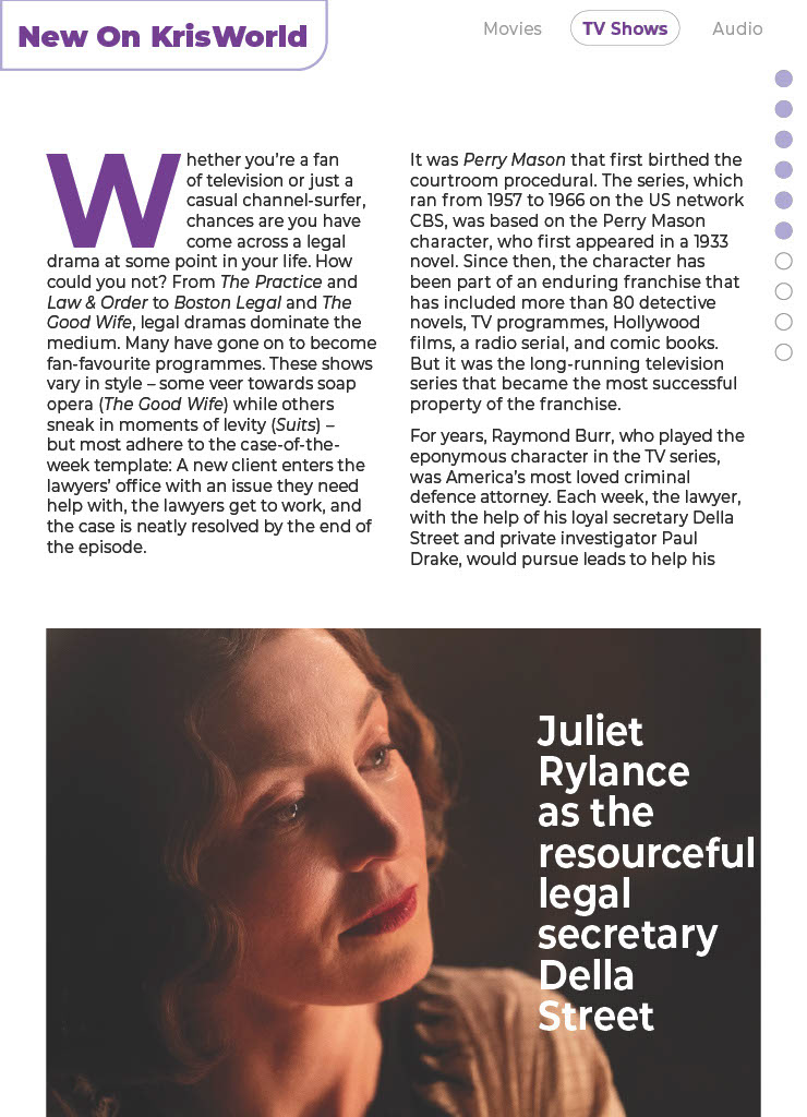
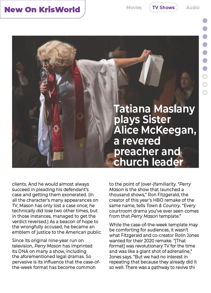
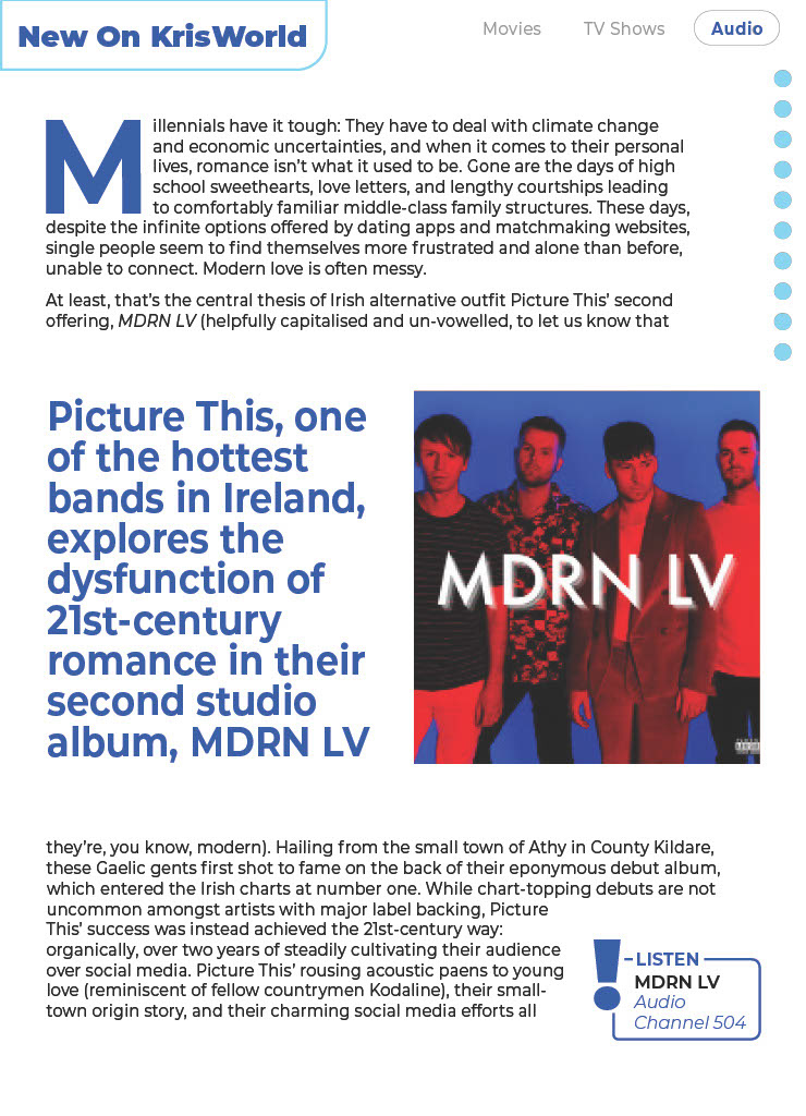
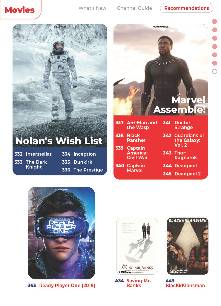
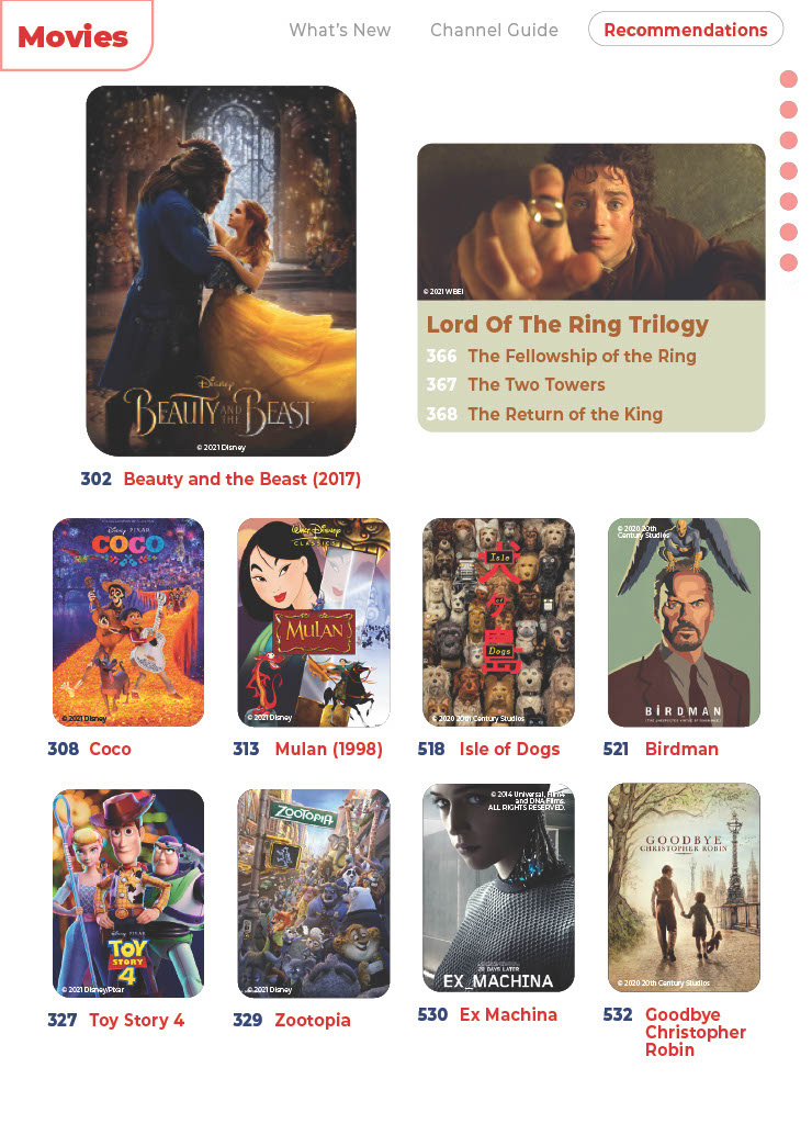
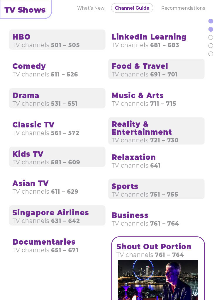
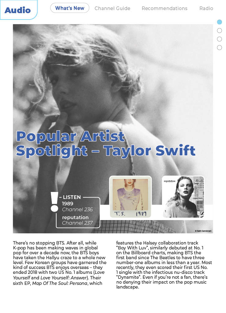
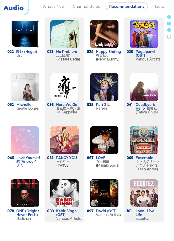
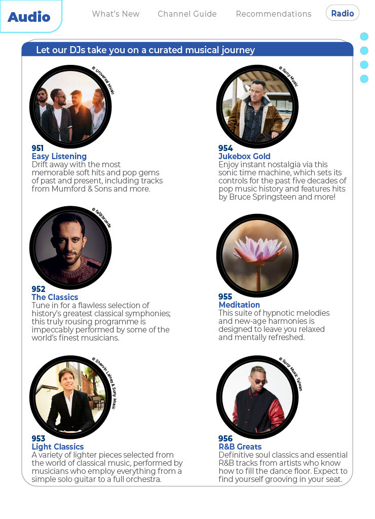
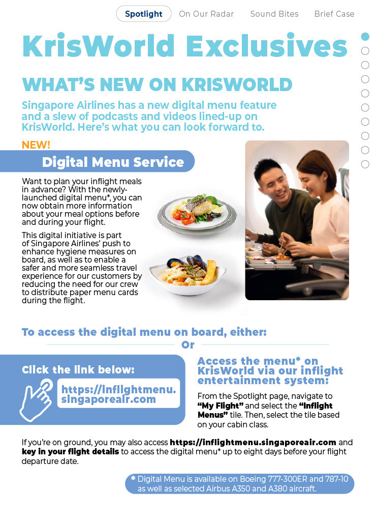
The first portion would be in the operational items: technical data, offerings, specificities, information has to be condensed to be concise, to the point and informative so that audiences will be able to have a glance and fully understand the information they are presented with. A "user interface" is included to help aid with the digital experience of viewing a linked pdf.
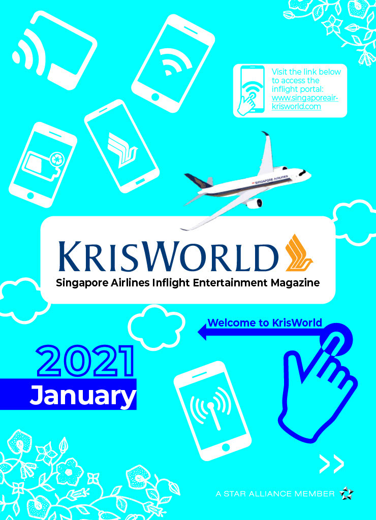
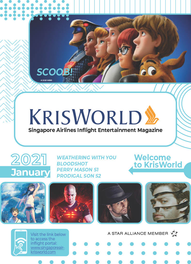

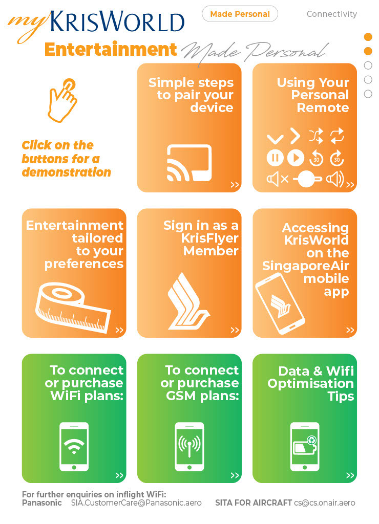
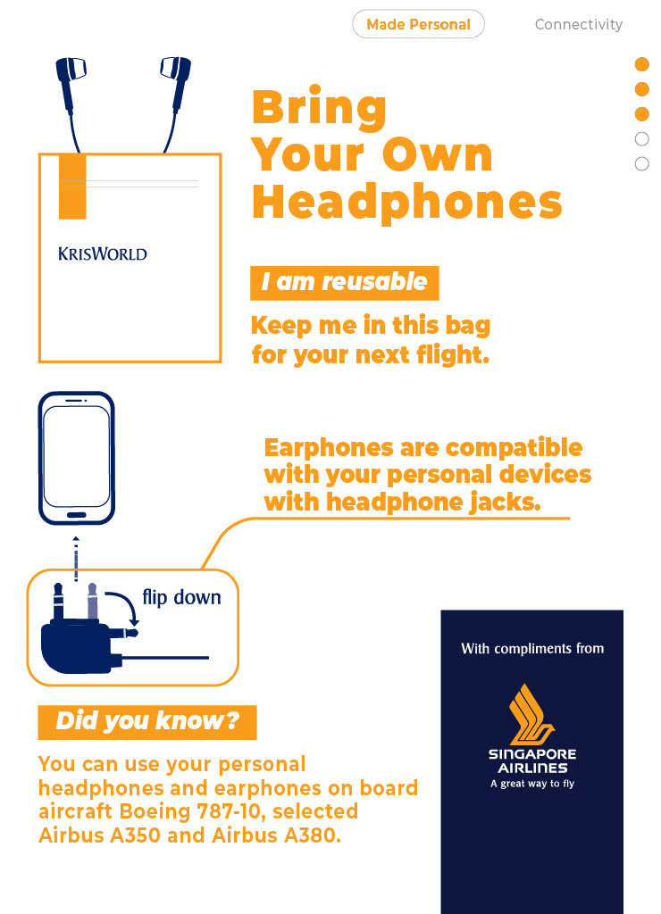

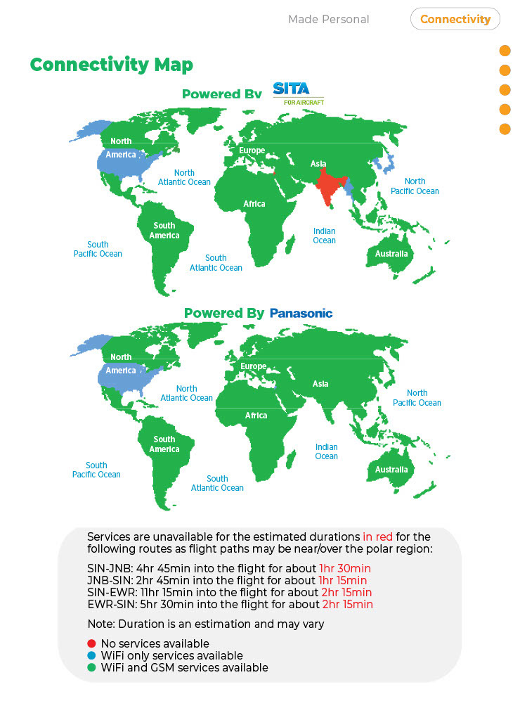
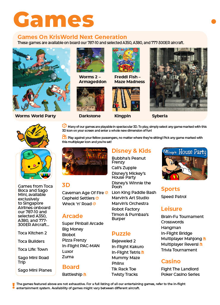
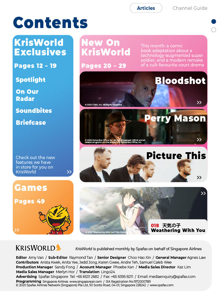
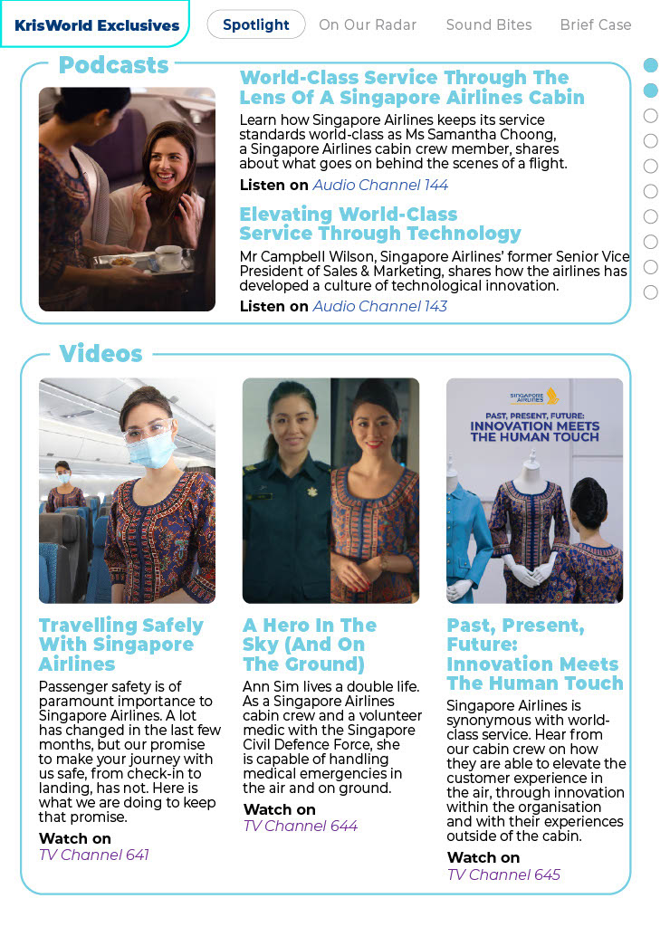
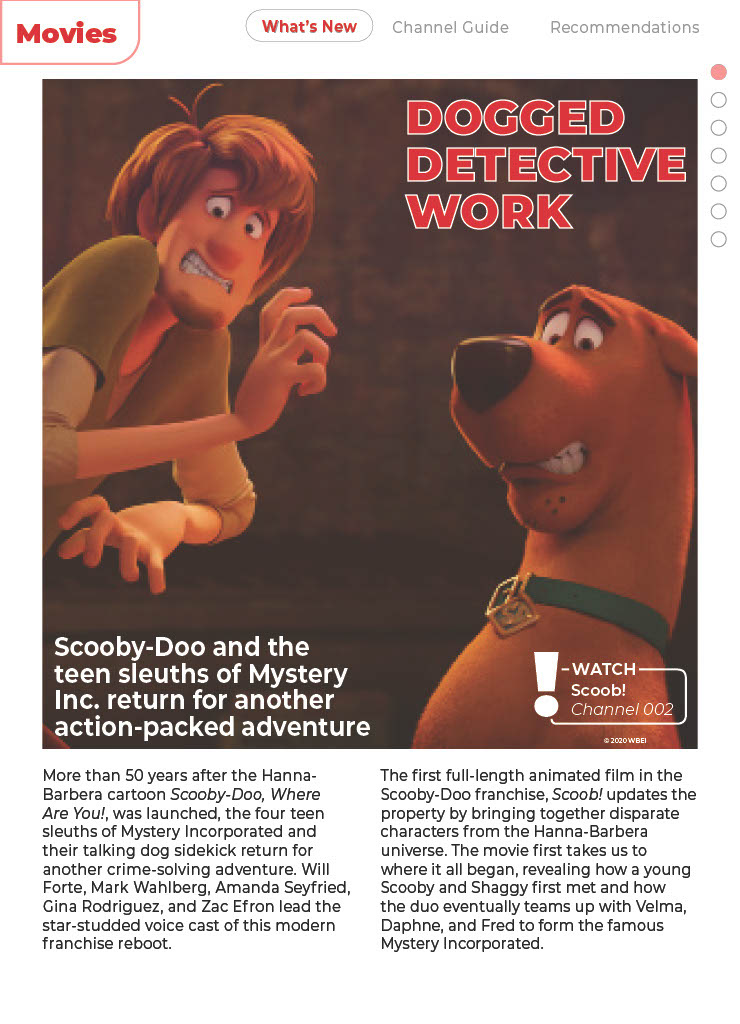
Content is not only meant to be concise and always straight to the point. Variety is key in keeping engagement with audiences. Therefore, one can always consider whether talking points have to be a current offering (IFE content is usually afew months behind mainstream releases), or something that might be of the current social sphere / talking points. Short bits might also be an engaging piece of content for a quick hook.

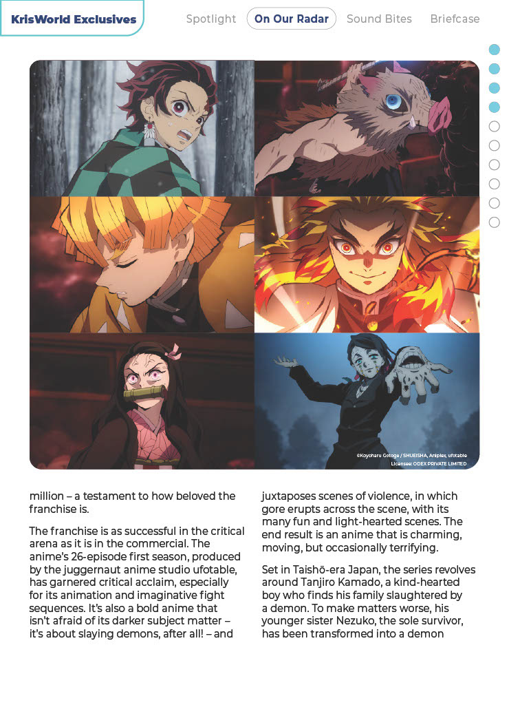

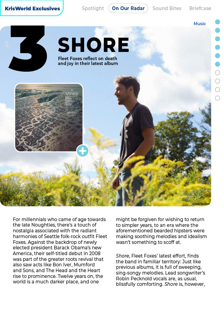

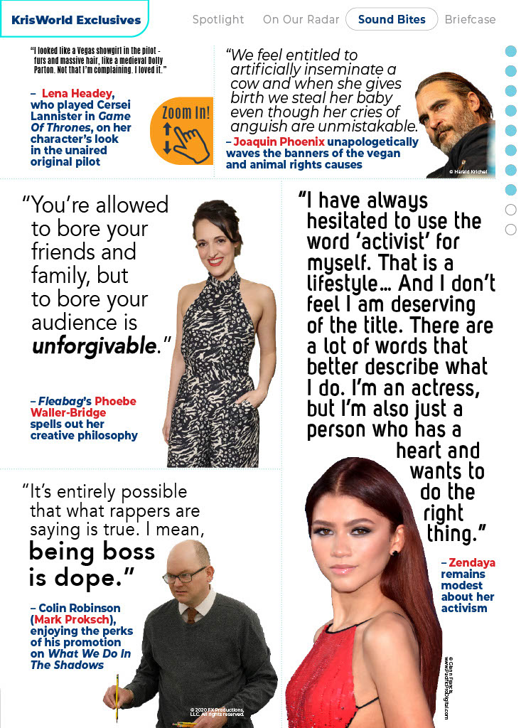
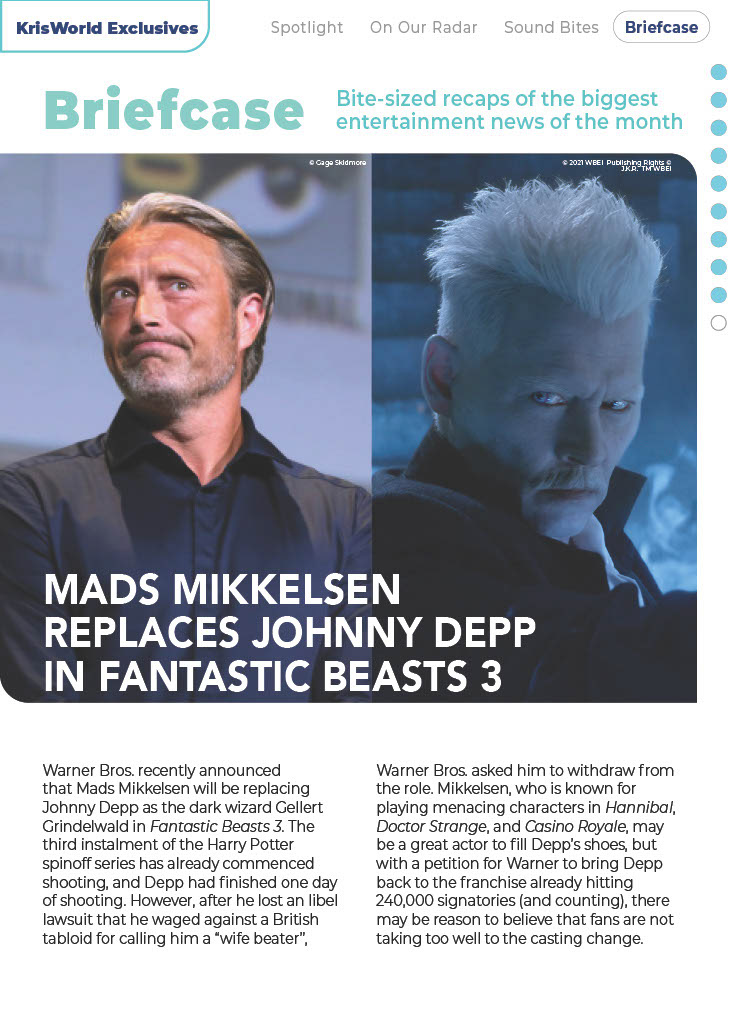
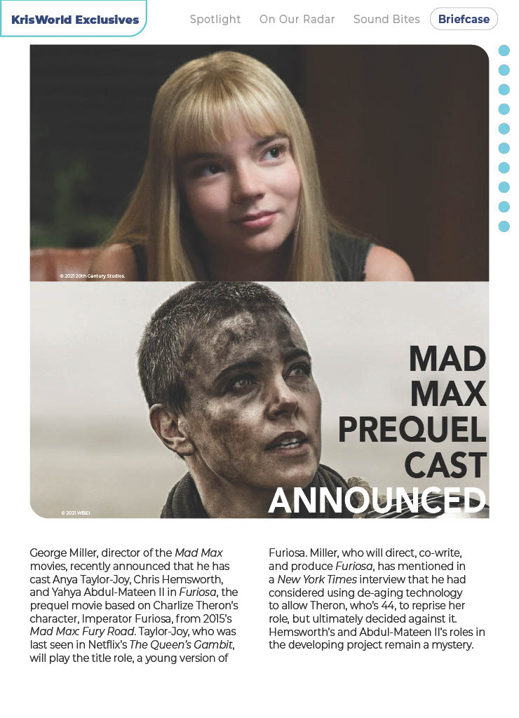
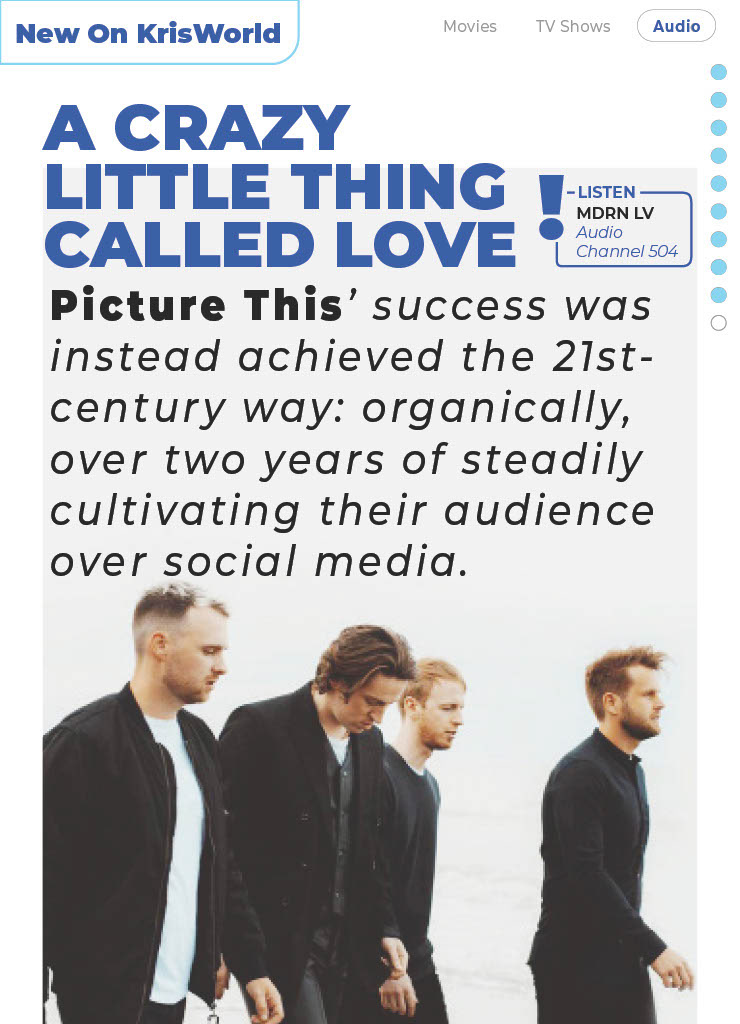
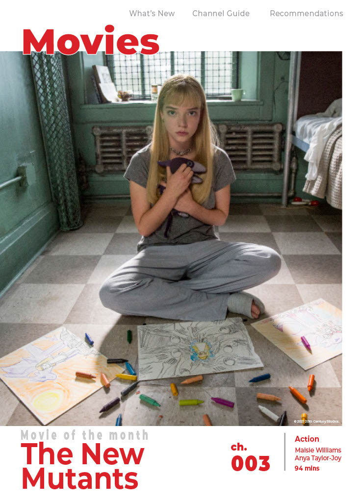
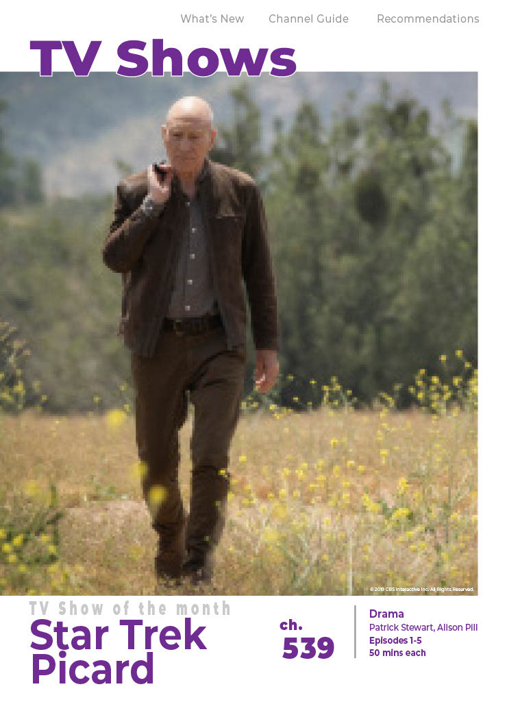
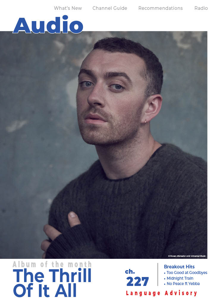
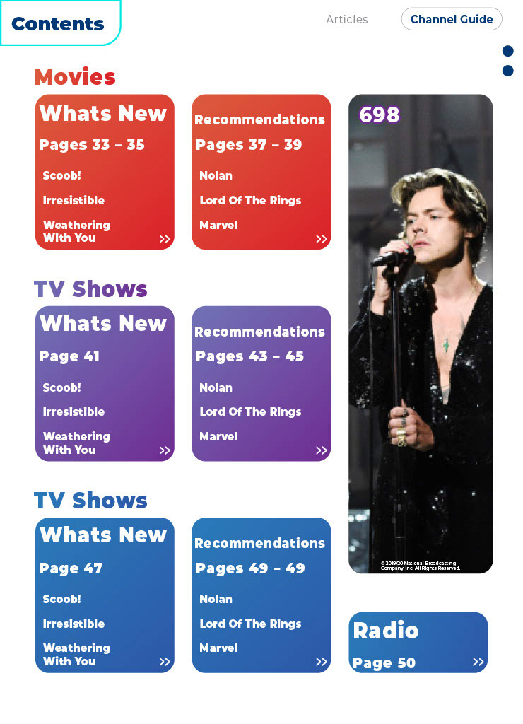
Of course like any good lineup of content, longer forms and main focus points should of course be tuned to push for the larger narratives. In KrisWorld's context, it would be in advertising for the monthly main titles for each category. In terms of design, geometric shapes are used to help viewers easily understand which category they are in as the format can get repetitive with the sheer amount of content an IFE system has.

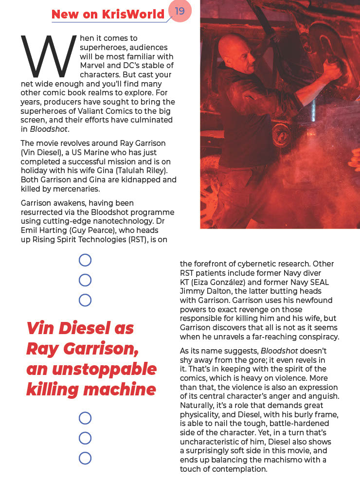


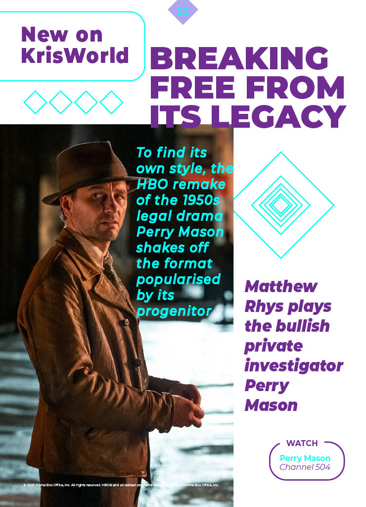
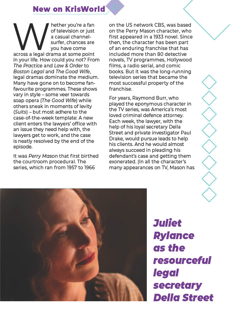


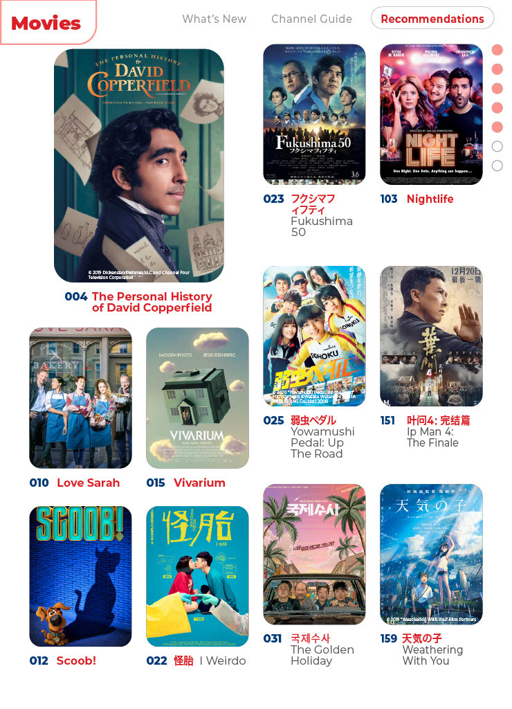
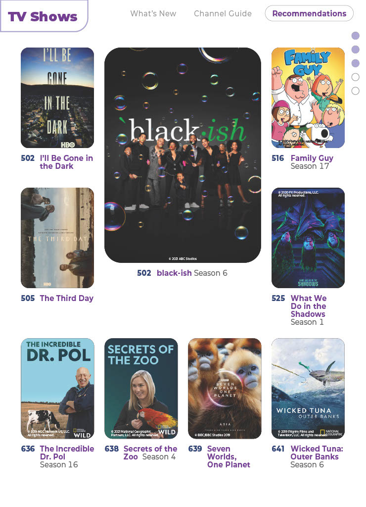
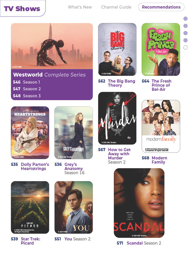
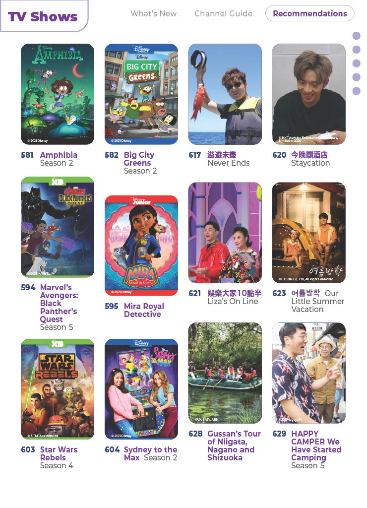
In terms of optimizing listings, reptition and cluttering is our worst enemy. The below is a visual explorarion of layout and design choices. Information is kept to the bare minimum on consideration that the e-magazine is used in tandem with the IFE system.
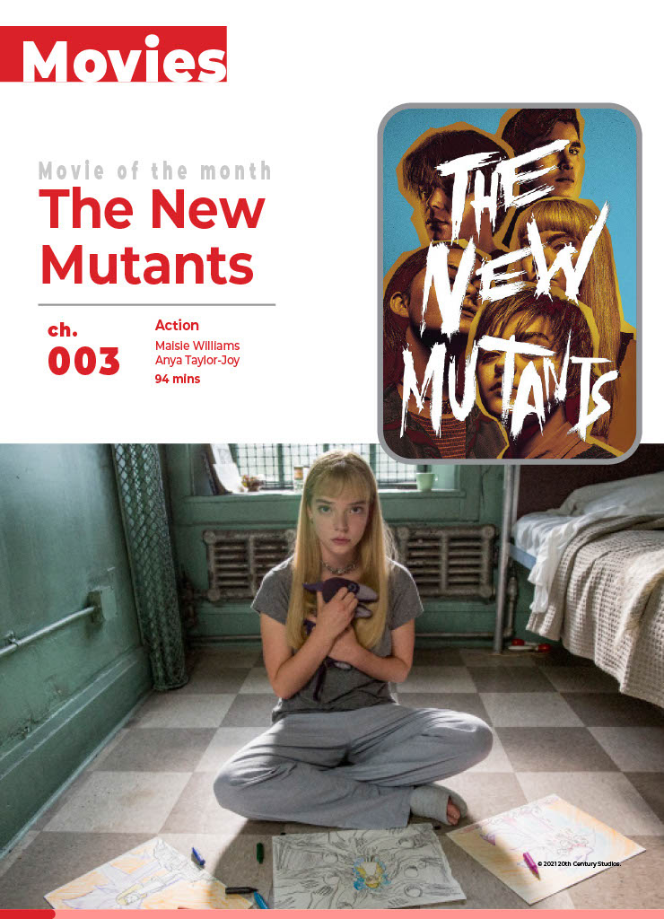

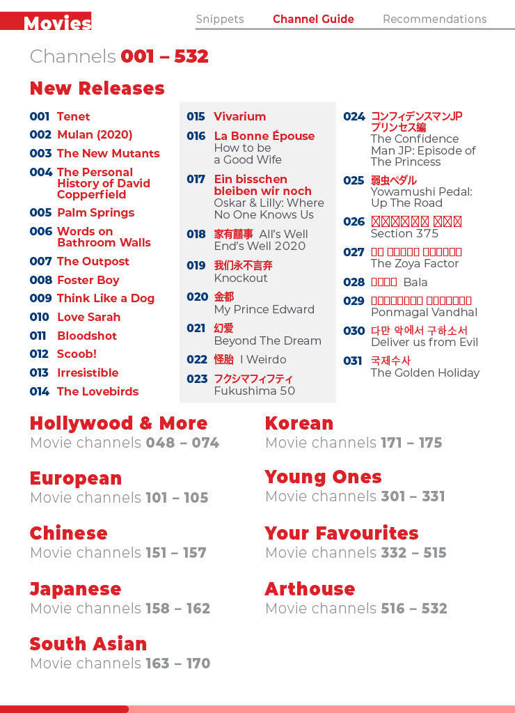
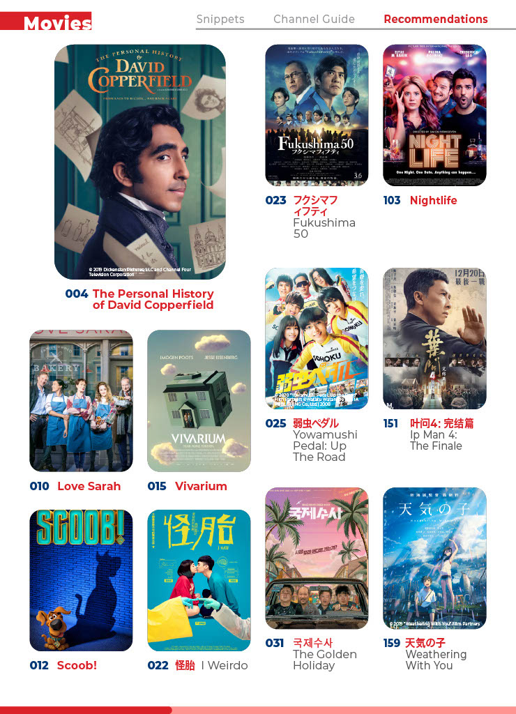
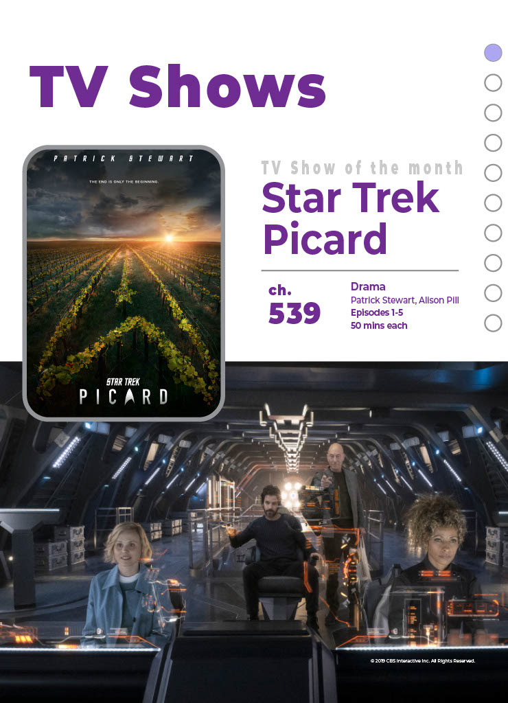





The below is the adapted style used. Simple, clean and one that mimics a digital interface, telling of the page as well as sub category the viewer is in.
